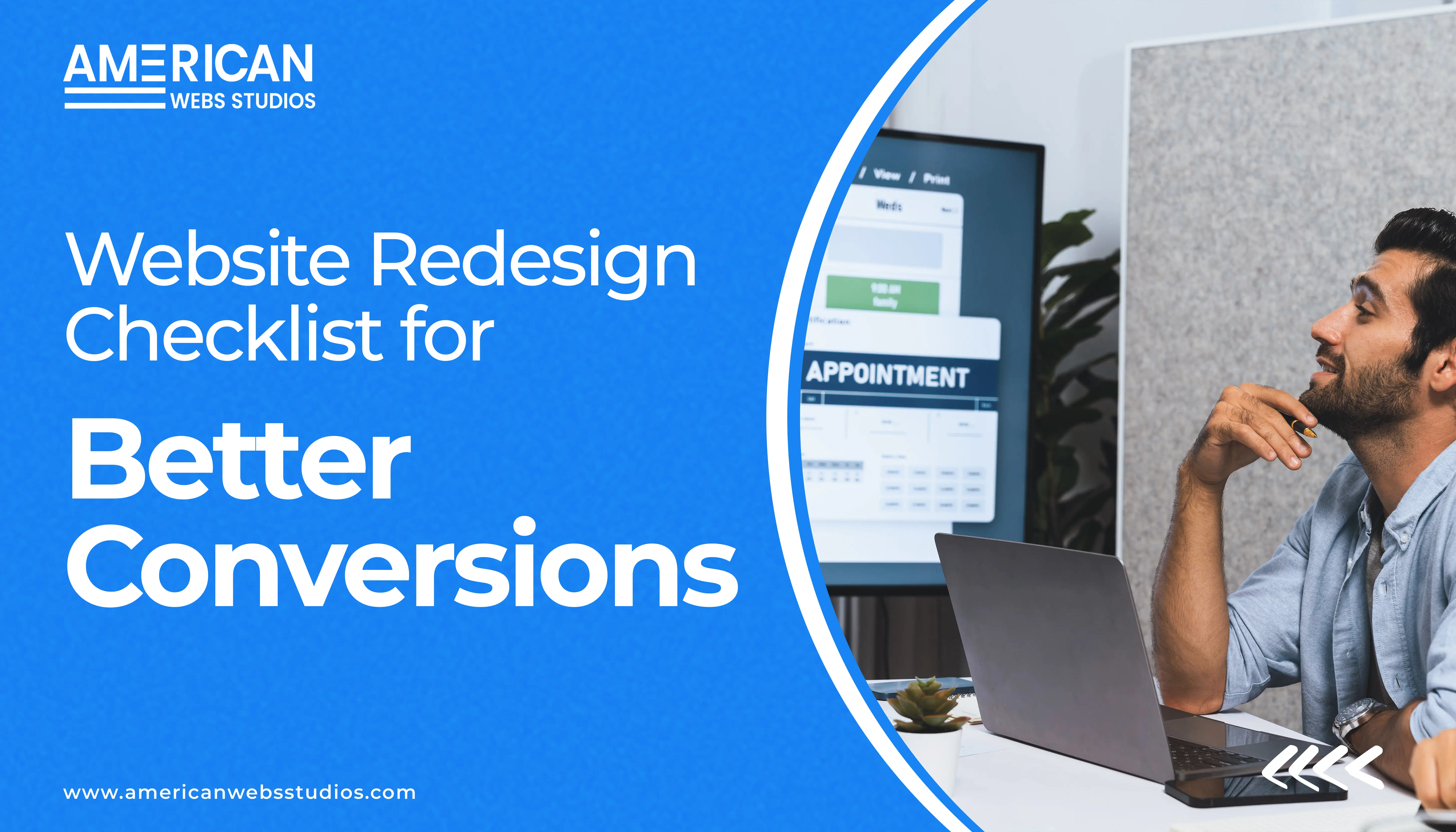
Redesigning a website sounds simple at first… until you start digging into it and realize how many little things affect the way people use your site. A new layout or fresh colors helps, but the real purpose behind a redesign is to guide your visitors to move through the site more easily and feel confident enough to take action.
Before you get jumped into fonts or graphics, it helps to slow down and look at what actually affects conversion optimization and user experience. A redesign is your chance to fix old mistakes and build something that feels clean, clear, and comfortable to use.
A website that converts well doesn’t confuse people. Your message should be obvious the moment someone lands on your homepage. No guessing. No digging. Clear headlines work better than long paragraphs. Let your visuals quietly support the message instead of competing with it.
A website that converts well doesn’t confuse people. Your message should be obvious the moment someone lands on your homepage. No guessing. No digging. Clear headlines work better than long paragraphs. Let your visuals quietly support the message instead of competing with it.
If visitors can’t find what they’re looking for, they leave. It’s really that simple. A redesign is a perfect moment to trim down your menu, reorganize pages, and create a flow that feels logical. The fewer obstacles people encounter, the more likely they are to stay long enough to take action.
Try to make the important things stand out: the contact button, the main service, and the sign-up link. Not in a pushy way. Just placed in spots where the eyes naturally land. Good layout doesn’t shout; it gently guides.
Most visitors are on their phones now. If your mobile layout feels cramped or broken, your conversions will drop fast. During your redesign, look at every page on a small screen. Make sure buttons aren’t tiny, text is readable, and nothing seems squeezed. A smooth mobile experience can double your chances of keeping a visitor.
A good website design can’t make up for slow loading. Heavy images, unnecessary plugins, and old scripts all slow your pages down. A redesign is the best time to clean house, remove what you don’t need, and make your site lighter and faster.
Forget what the business wants for a moment and think about how a visitor moves through the site. Are the forms simple? Do the buttons make sense? Does the page feel overwhelming or easy to follow? People convert when the path feels natural, not forced.
Every part of your site, from forms and buttons to menus and images, should feel smooth and effortless. If any step is confusing or takes too long, users simply won’t complete it. With the right UX improvements, the experience becomes easier, clearer, and more enjoyable, and your conversion rate naturally increases.
A website redesign is more than an upgrade; it’s about building an experience that is intuitive, modern, and trustworthy. When your message is sharp, your pages load fast, and the layout guides visitors instead of overwhelming them, conversions improve on their own.
If you’re considering a redesign and want a site that’s genuinely pleasant and effortless for users, US Web Studio can help you create a streamlined, conversion-focused, and friendly experience.


 (405) 237-5719